Dealing with Debt Never Looked So Good
2 min read
Posted on December 13, 2022

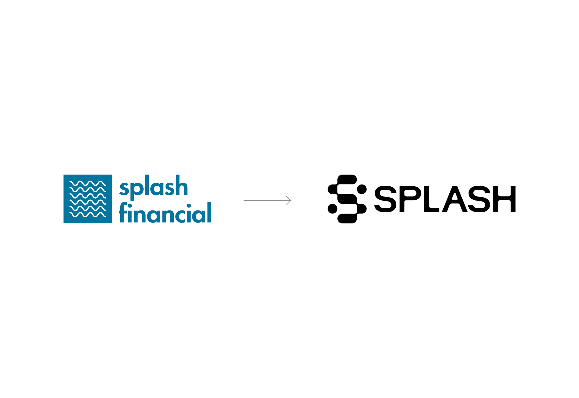
Today is a big day for us at Splash: we’re launching our new brand. This means creating an entirely new visual identity from the ground up, including everything from a new logo to a new color palette, imagery, copy and more.
For all the brand and design nerds out there, we wanted to give a behind-the-scenes look at the strategy and design development behind our new look and feel.
WHERE TO BEGIN?
Building a brand can be a daunting task, so we followed brand expert Simon Sinek’s advice and started with why. Our Why, our purpose, is captured in our mission:
Make People More Powerful Than Their Debt.
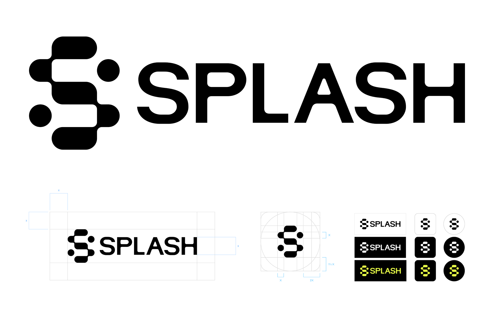
Debt is sometimes viewed as a sign of financial failure. In reality, how you handle your debt can provide the building blocks upon which major life milestones are possible. Becoming more powerful than your debt takes thoughtful planning at each step, and we’re hopeful Splash is the place where people can create those building blocks to success. Our new logo reflects this “building block” notion in the stair step “S” icon, where each part of the “S” is a fluid, connected step on a journey upwards; and where Splash acts as the connector between consumers and lenders, who are each represented by a circle. This complements the accessible feel of the hand-drawn letters in the wordmark.

TONALITY MATTERS
We want our customers to feel comfortable interacting with us, so we want to keep our tonality straightforward and accessible. At the same time, who doesn’t love a little humor and fun to go with their financial journey? So, we define our voice as “your wise and witty financial fixer,” aiming to feel like that trusted person in your life – like the family member who always has your best interests in mind, that friend who just gets you, the colleague who seems to always have the inside scoop, the companion who you admire and laugh with. That guiding principle leads to fun headlines like:

WHAT'S IN A COLOR?
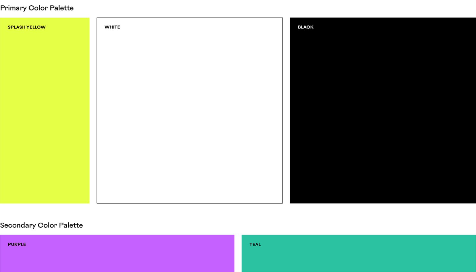
There are 18 decillion colors in the world, so how do you choose just one? We knew we wanted something bold that stood out in the crowded Fintech landscape and spoke to our core audiences. Additionally, it’s important for our colors to reflect the serious nature of the financial services industry, while also creating space to be bold and modern, and to project hope and optimism. So, we landed on the primary colors of black and white with a large splash (forgive the pun) of a bold “highlighter yellow.”

PICTURE THIS
If a picture speaks 1,000 words, we didn’t want any of them to be “corporate” or “boring.” We want more “day in the life,” “modern” and “compelling.” We’re a startup, and we want as much of our money as possible to go into our customer experience–not a big expensive photoshoot. All the images you see are stock (but hopefully don’t feel like it!).

We are confident that our new brand, in combination with many user experience enhancements throughout the site, will help people expand their financial knowledge and find products that further deliver on our mission to help them become more powerful than their debt.
Disclaimer
The information provided in this blog post is not intended to provide legal, financial or tax advice. We recommend consulting with a financial adviser before making a major financial decision.